This article will be about a very impressive website called blokchaincenter.net. Kudos to the owner because it looks really good and it offers a great set of monitoring tools for crypto markets. I will detail the 10 best crypto indicators (this will complete another article on the same topic) available on it and explain how I use them to invest. Most of them are useful for me to navigate the different phases of the market and make the right crypto investments.
1. The Bitcoin Rainbow Charts
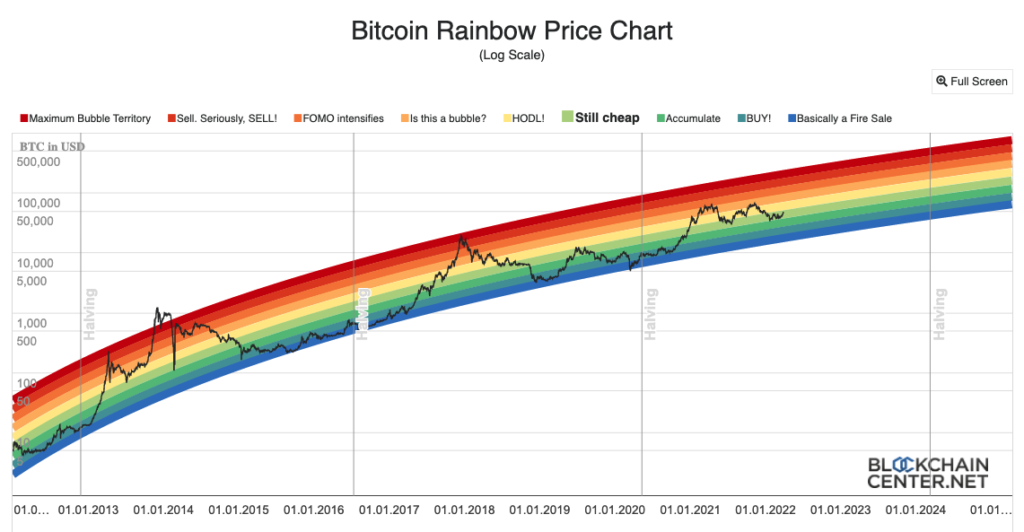
The basics of chart analysis for crypto are the holy logarithmic regression bands (also called “rainbow charts”). These bands tell you when to buy and when to sell based on a statistical approach. Why is that? Well, growing complex systems have a logarithmic shape when their signal is displayed against a logarithmic y-axis. By fitting that curve using the Bitcoin price, and creating different band levels around it, it’s possible to assess how undervalued or overvalued the price of Bitcoin is:
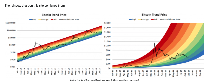
I buy Bitcoin in the blue, green and yellow zone. I start to sell Bitcoin in the red ones. There are variants of this, depending on how you like to visualize those levels. Some examples based on different scales for the y-axis or different equations for the regression:
It’s one of the best crypto indicators.
2. The Altcoin Season Index
Another very important factor to consider when investing in crypto is the seasonality of the space. It is absolutely mandatory to understand that well because buying a massive amount of altcoins at the top of an altcoin season is probably the worst mistake to make. I love to use this altcoin season index to evaluate if we’re in a “Bitcoin season” (Bitcoin very strong, altcoins lagging behind) or an “altcoin season” (the opposite):
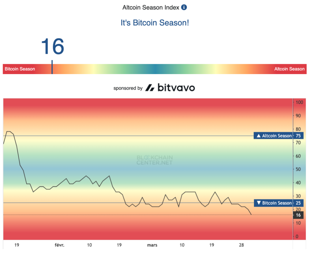
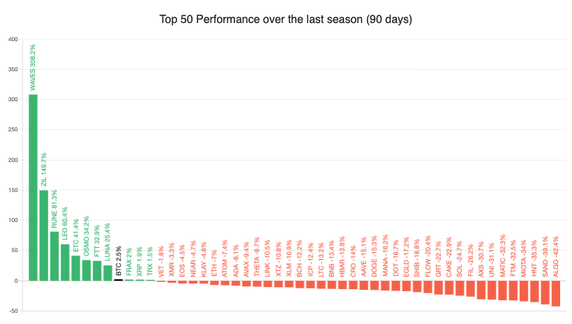
I usually buy altcoins during a “Bitcoin season” and Bitcoin during an “altcoin season”. I love the level of detail provided with it. For example, detail of the weights of each crypto in the calculation of the index:
3. The Correlations Matrix
The next piece of logic I like to use when investing is a correlation matrix. I use it to see what coins are correlated to one another. You don’t want to put all the eggs in one basket, do you?
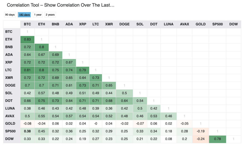
The cherry on the cake: you can actually visualize a given correlation by clicking on it. It will then display the rolling average of the correlation coefficient between the two assets:
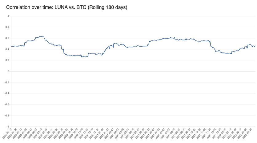
I often check this tool to make the right crypto investments: it’s one of the best crypto indicators.
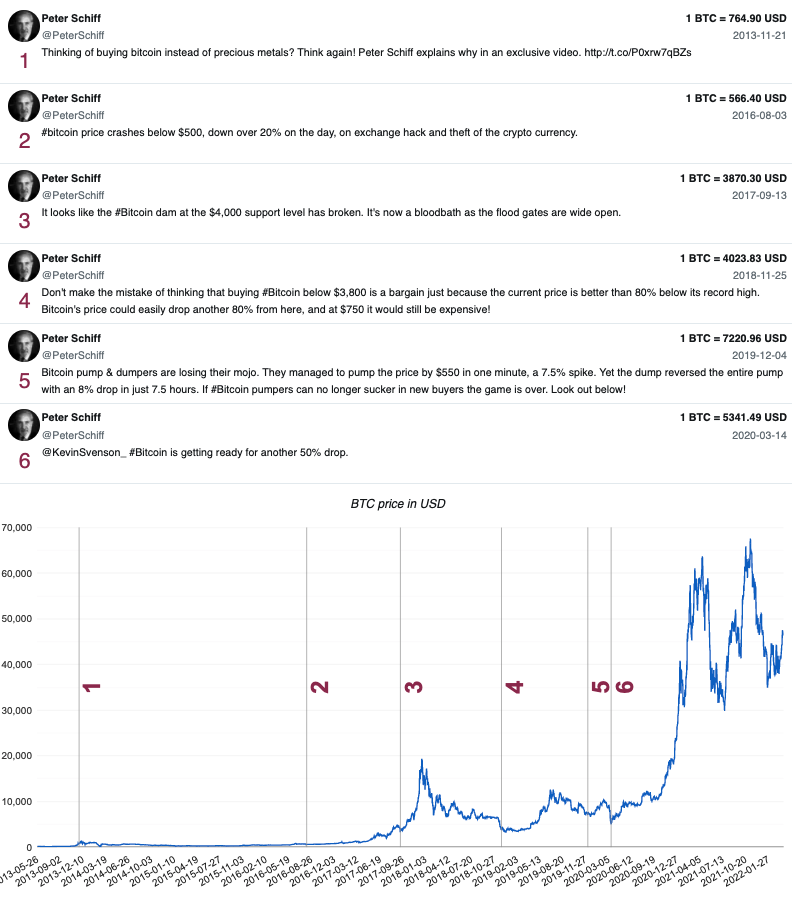
4. Tweet-Price Chart
Do you know a good way to use social media to time your buys? I do it, just by using this tool. For example, when Peter Schieff is criticising Bitcoin and calling it a scam, it’s a buying zone:
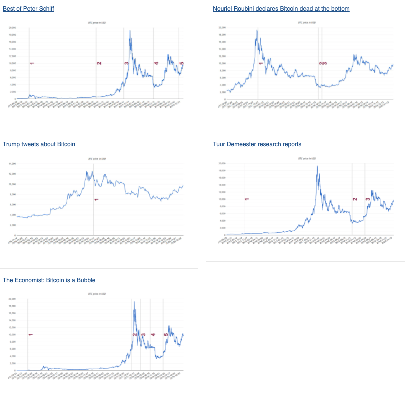
If you also want (you’re greedy!) a good laugh, have a look at the list of ideas people have added (it’s an interactive tool):
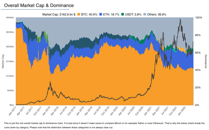
5. Market Dominance Maps
Another tool I like is the market dominance map. It helps you to know if it’s time to buy Bitcoin or altcoins. If Bitcoin is very high in dominance, it’s time for an altcoin investment. If altcoins are way too important with respect to Bitcoin, it’s time for a Bitcoin investment:
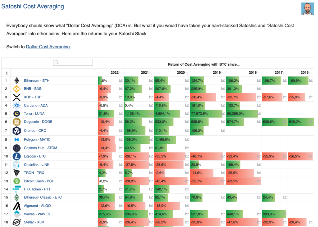
6. Satoshi Cost Averaging
What happens if you dollar cost average your Bitcoin/Satoshis into other coins? I like this Satoshi Cost Averaging view to check what your return would be by diversifying your Bitcoin into other assets and make the right crypto investments:
7. Flippening Index
The flippening index is a way to visualise how close Ethereum is to flip Bitcoin. I consider that, when this index is close to 100%, it’s time to buy Bitcoin instead of Ethereum. When this flippening index is too low, time to buy Ethereum:
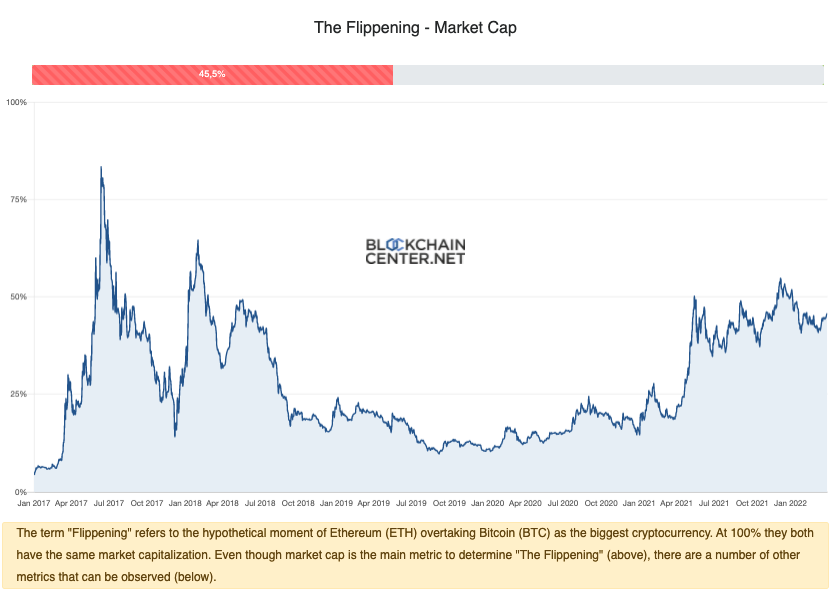
As you can see, it’s an oscillating movement. It is very useful to make the right crypto investments. And I can give you my opinion: no, Ethereum will not overtake Bitcoin, just like Apple stock didn’t overtake gold. This is obviously my (very debatable) opinion and certainly not financial advice.
8. Bitcoin Supply Block Visualisation
A way to realize what you’re doing with Bitcoin is to look at the supply. It is very helpful to realize the weight of institutional adoption and what it means to invest in it. I keep an eye on this dashboard to verify who owns the most and check the level of decentralisation of the asset:
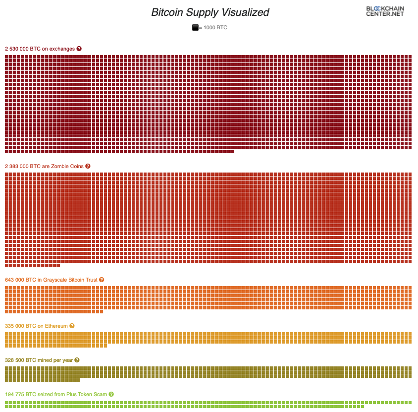
Fun fact, the biggest crypto funds and companies are competing with a pizza purchase from 2010:

Also, you can forget about these guys (a crazy amount of Bitcoin is actually lost!):

I also like to put this into perspective: what does that mean if Microstrategy decides to sell? What if Grayscale decides to sell? But also, what does that mean if they buy more in term of centralization of the asset class as a whole?
9. Ethereum Rainbow Chart
Just like the rainbow chart for Bitcoin presented first, It’s interesting to do exactly the same for Ethereum to decide if you should buy Ethereum of if you should sell Ethereum. I always have a look at the Ethereum rainbow chart to verify how undervalued or overvalued Ethereum actually is:
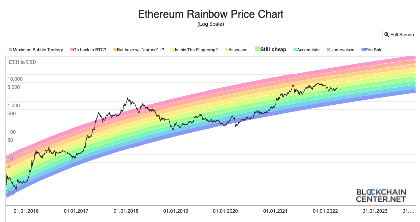
It’s fair to insist on the fact that Ethereum price movements are highly dependent on Bitcoin price movements. I only look at that chart when I know if we’re in a bull or bear market. This is often decided by how Bitcoin behaves first but I still think it’s one of the best crypto indicators.
10. NFTs The Celebrities Own
NFTs are all about adoption. It’s important to check if celebrities are buying NFTs or selling them, just to understand if the adoption is going up or down. As a consequence, I like to keep an eye on this dashboard with the name of celebrities owning famous NFT collections:

You will find the same for cryptopunks with surprising names (if you didn’t follow the news lately):

I actually had no clue that Serena Williams was in the NFT game. What are you waiting for to get your 152k USD JPEG? 😀
Thanks for reading.
Disclaimer: this is not financial advice
